 .
.Motorcycle dashes/gauges don't make or break a design, but a cleanly designed dash is part of the complete package. The attention to detail separates the classics from the rest. Tiny, digital gauges help clean up the sloppy factory look, but gauges, just like lights, can be an opportunity to display creativity and integrate the sum of the parts.
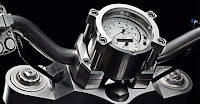
This is one of the best motorcycle dash/gauges I've seen. A toast of Blanton's to the Yamaha designer for this simple & instantly timeless design. This is from the supercool bench-seat, v-twin Sakura concept. (check out the key).
The thin, side-profile is a crucial element to the overall design. The dash appears to be missing the odometer and tripmeter, but instead of the descriptions for km/hr and the rpm, they could use a very small and arc'd digital display, one on top of the central console and the other on the bottom (don't have to be able to see them while riding, unless that is some weird DOT stipulation)
The thin, side-profile is a crucial element to the overall design. The dash appears to be missing the odometer and tripmeter, but instead of the descriptions for km/hr and the rpm, they could use a very small and arc'd digital display, one on top of the central console and the other on the bottom (don't have to be able to see them while riding, unless that is some weird DOT stipulation)
One picture within the above link gives the impression that the back of this dash doubles as the horn.
Hopefully the aftermarket will offer something like this....
click for larger image
 The Confederate Hellcat's & Wraith's dash is a close second (below). Converse to the above dash, the stout depth to this unit is key to its form:
Simple, but powerful, just like a good air-cooled twin-cylinder motorbike
Related link
.

No comments:
Post a Comment